
Outside

Outside

Outside
Project Overview
Project Overview
My Role
My Role
Lead Design
Lead Design
Lead Design
Art Direction
Art Direction
Art Direction
UX/UI
UX/UI
UX/UI
Project type
Editorial
Outside is a magazine focused on outdoor recreation and adventure
Outside is a magazine focused on outdoor recreation and adventure
Outside is a magazine focused on outdoor recreation and adventure
The magazine covers a variety of topics, including hiking, climbing, cycling, running, and other outdoor sports and activities.
The magazine covers a variety of topics, including hiking, climbing, cycling, running, and other outdoor sports and activities.
The magazine covers a variety of topics, including hiking, climbing, cycling, running, and other outdoor sports and activities.

The Challenge
The Challenge
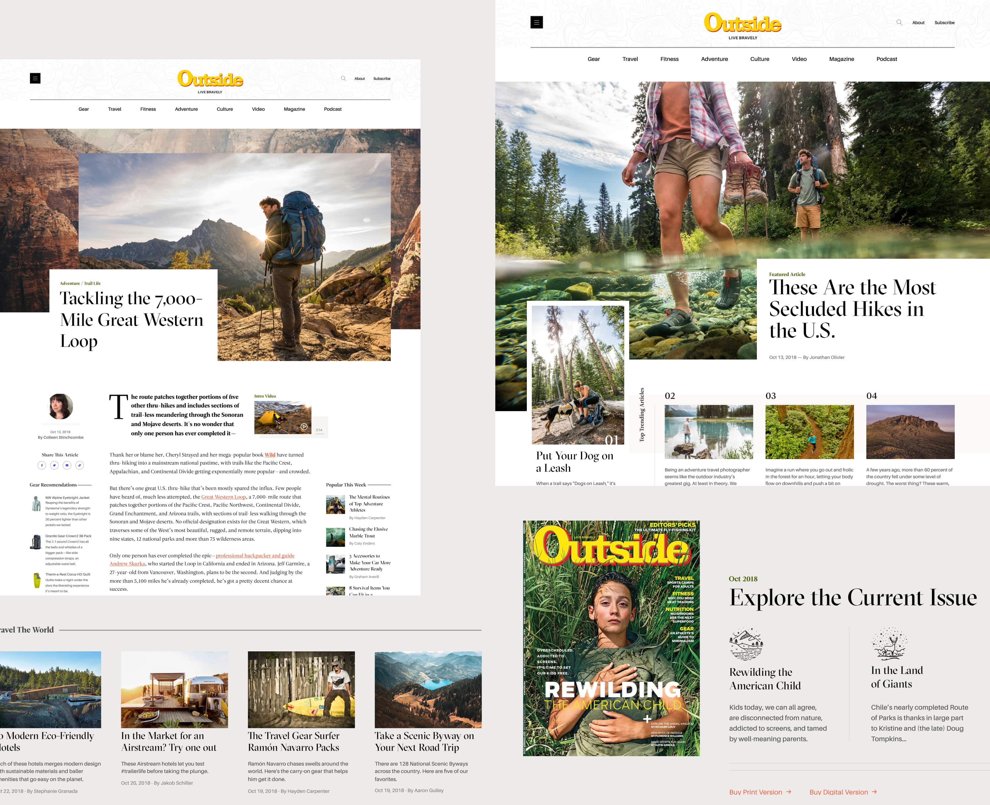
Outside magazine provides extensive coverage of outdoor sports, activities, gear, and techniques, as well as captivating narratives of those living life on their own terms. However, to differentiate itself, it must avoid generic and uninspired content, as well as a lackluster homepage in need of a boost of creativity.
Outside magazine provides extensive coverage of outdoor sports, activities, gear, and techniques, as well as captivating narratives of those living life on their own terms. However, to differentiate itself, it must avoid generic and uninspired content, as well as a lackluster homepage in need of a boost of creativity.

The Results
The Results
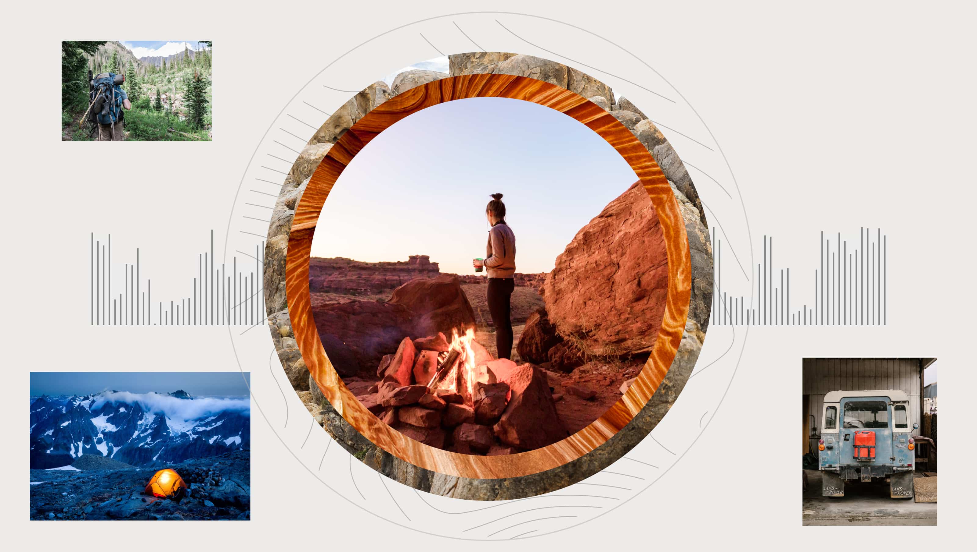
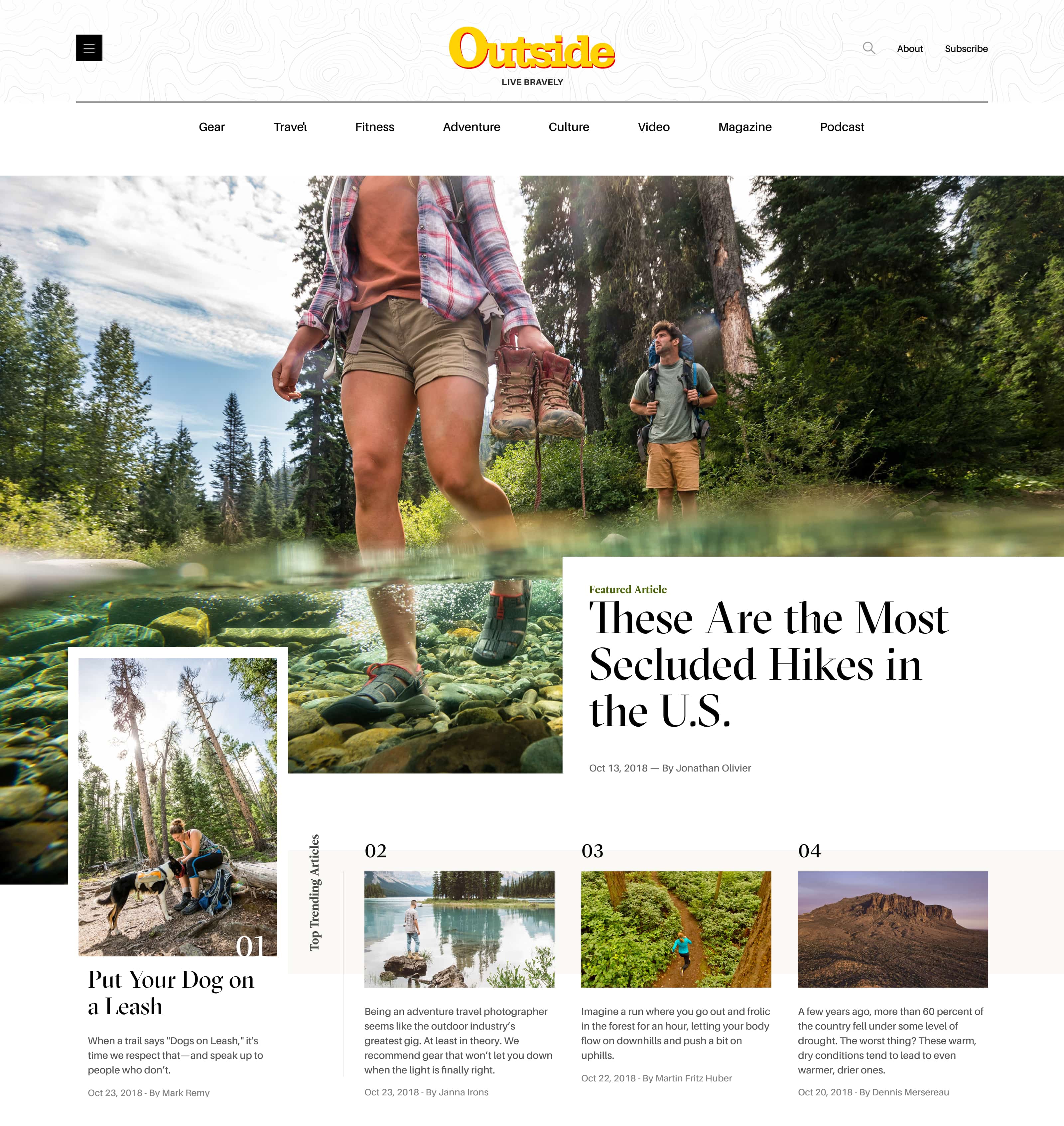
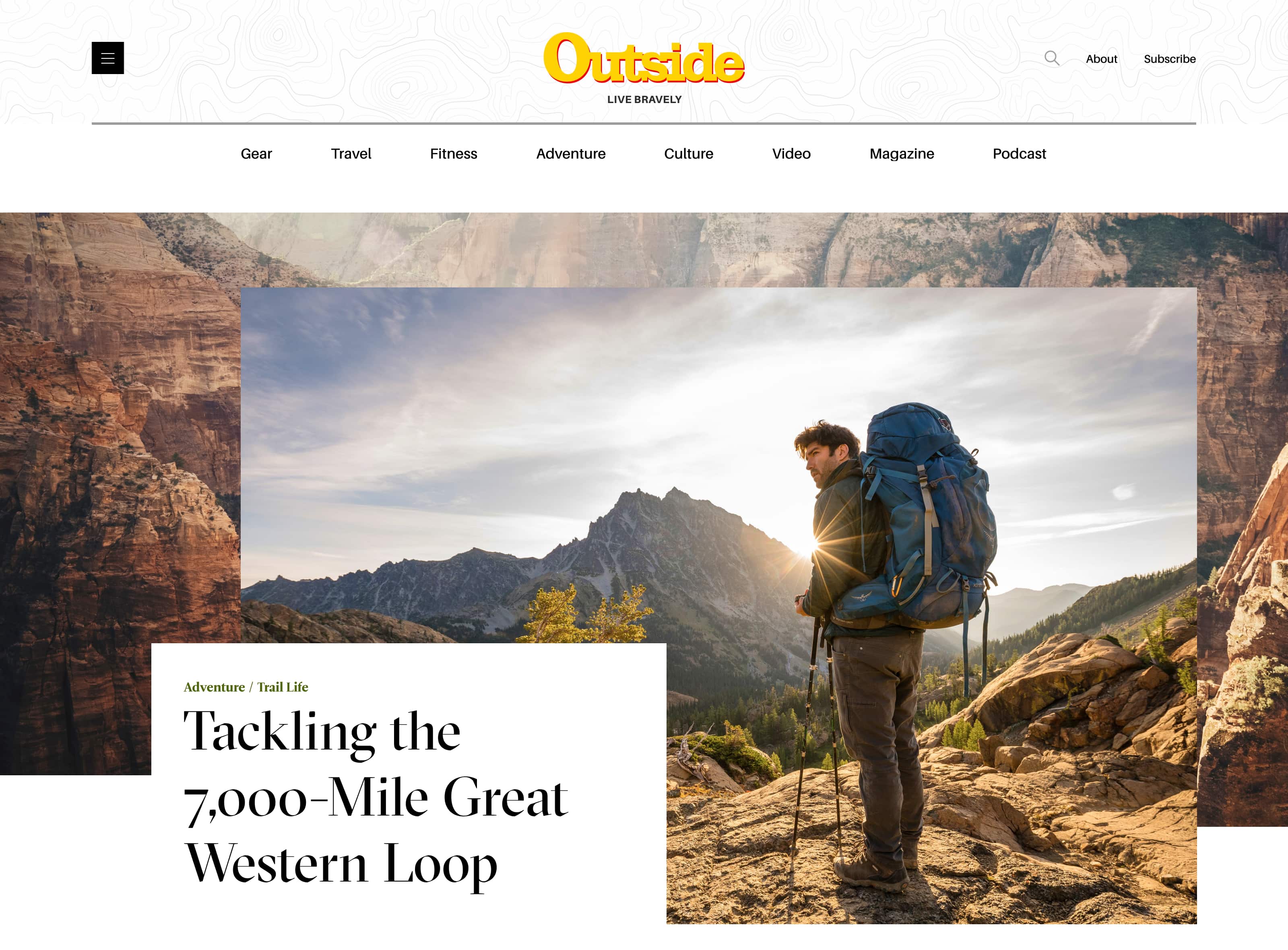
The goal of the redesign of Outside magazine was to create a homepage that not only showcased the wealth of content available but also drew the user's attention and guided them towards the most interesting and relevant articles. To achieve this, I advocated for a dynamic and all-encompassing design that would make an impact.
The homepage was crucial in this effort, as it had to be visually appealing and engaging while still being able to present the vast amount of content available. The design had to be able to balance the needs of the user and the magazine, ensuring that the user was able to quickly find what they were looking for, while also being drawn in to explore further.
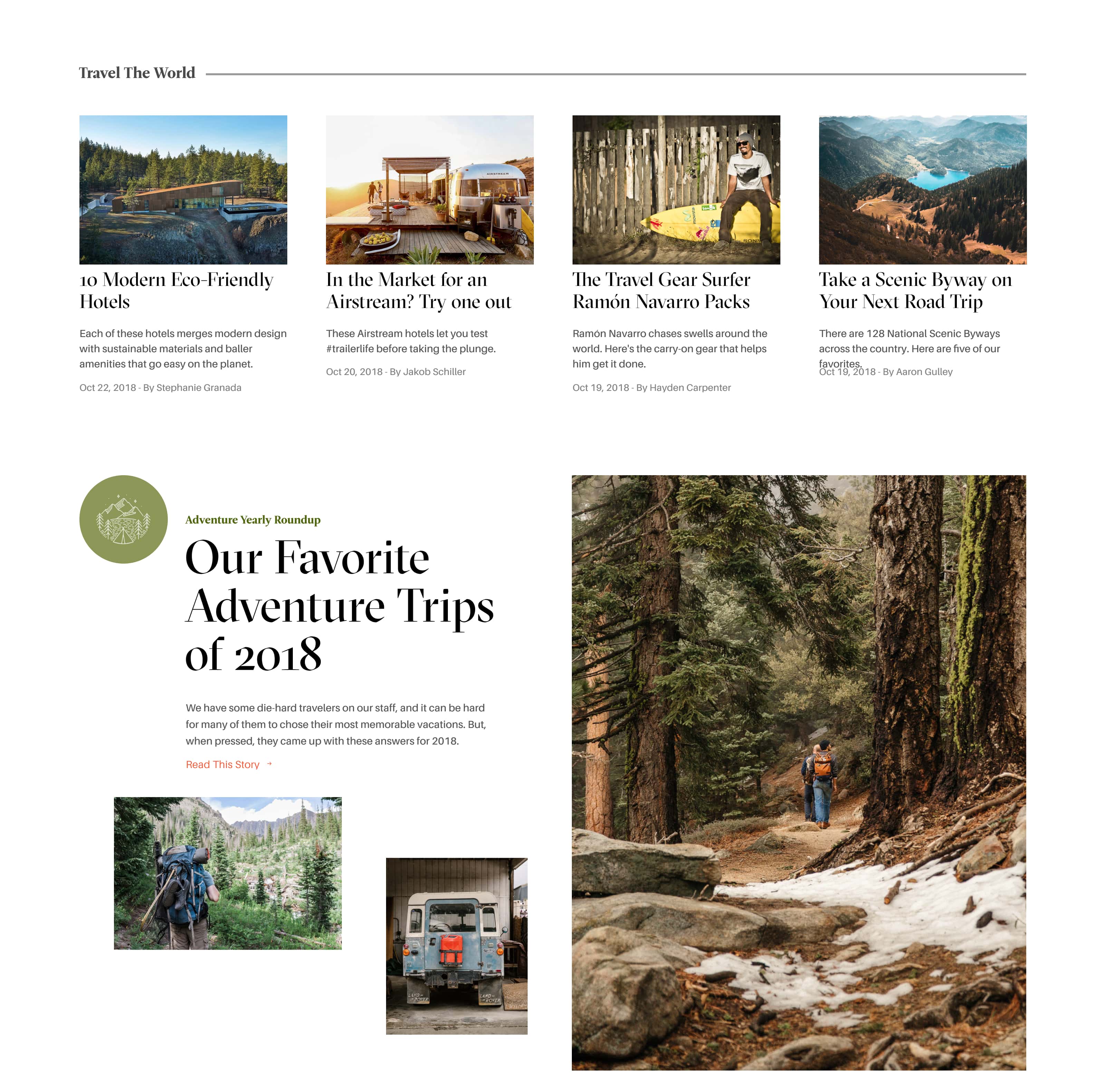
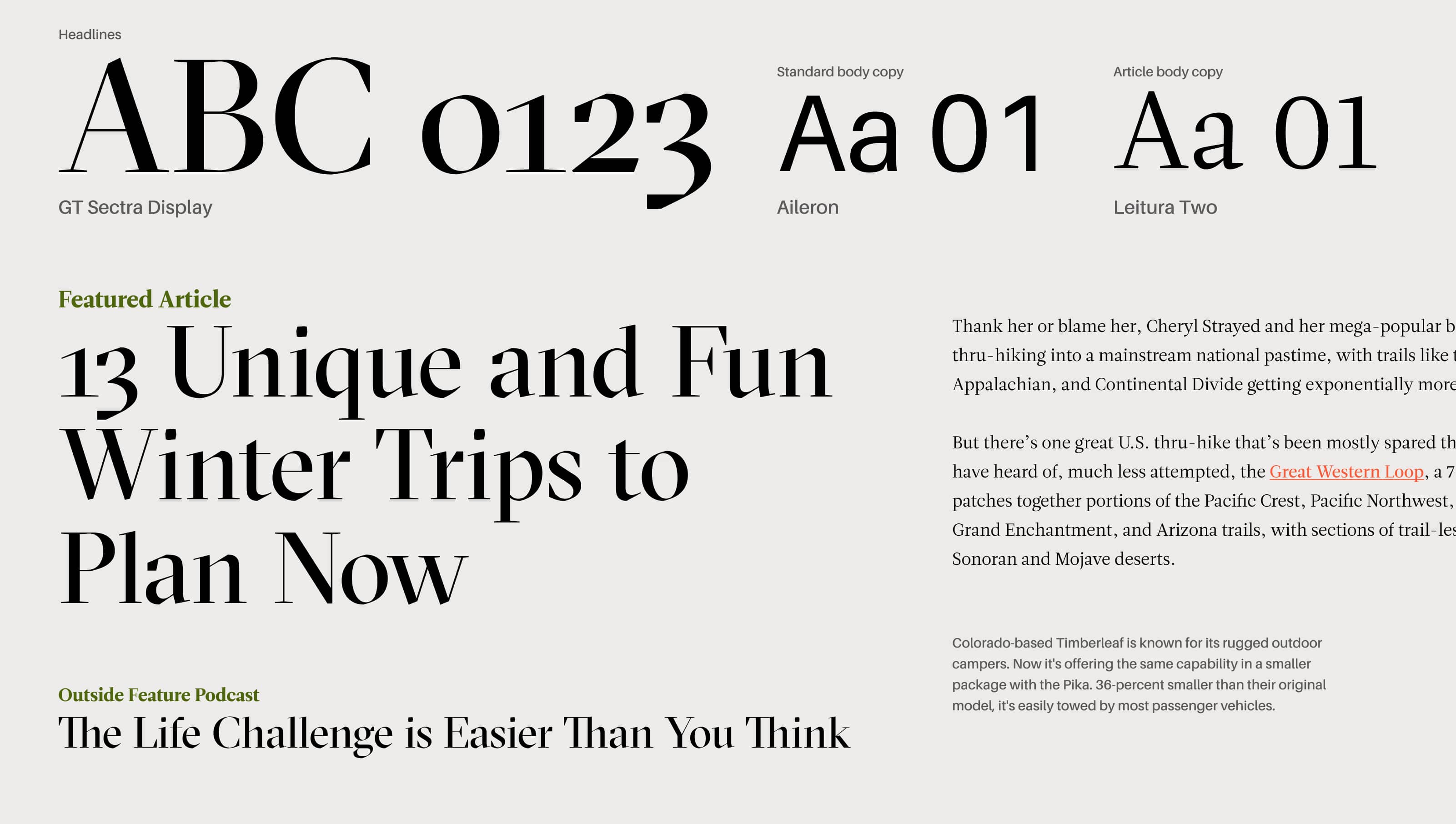
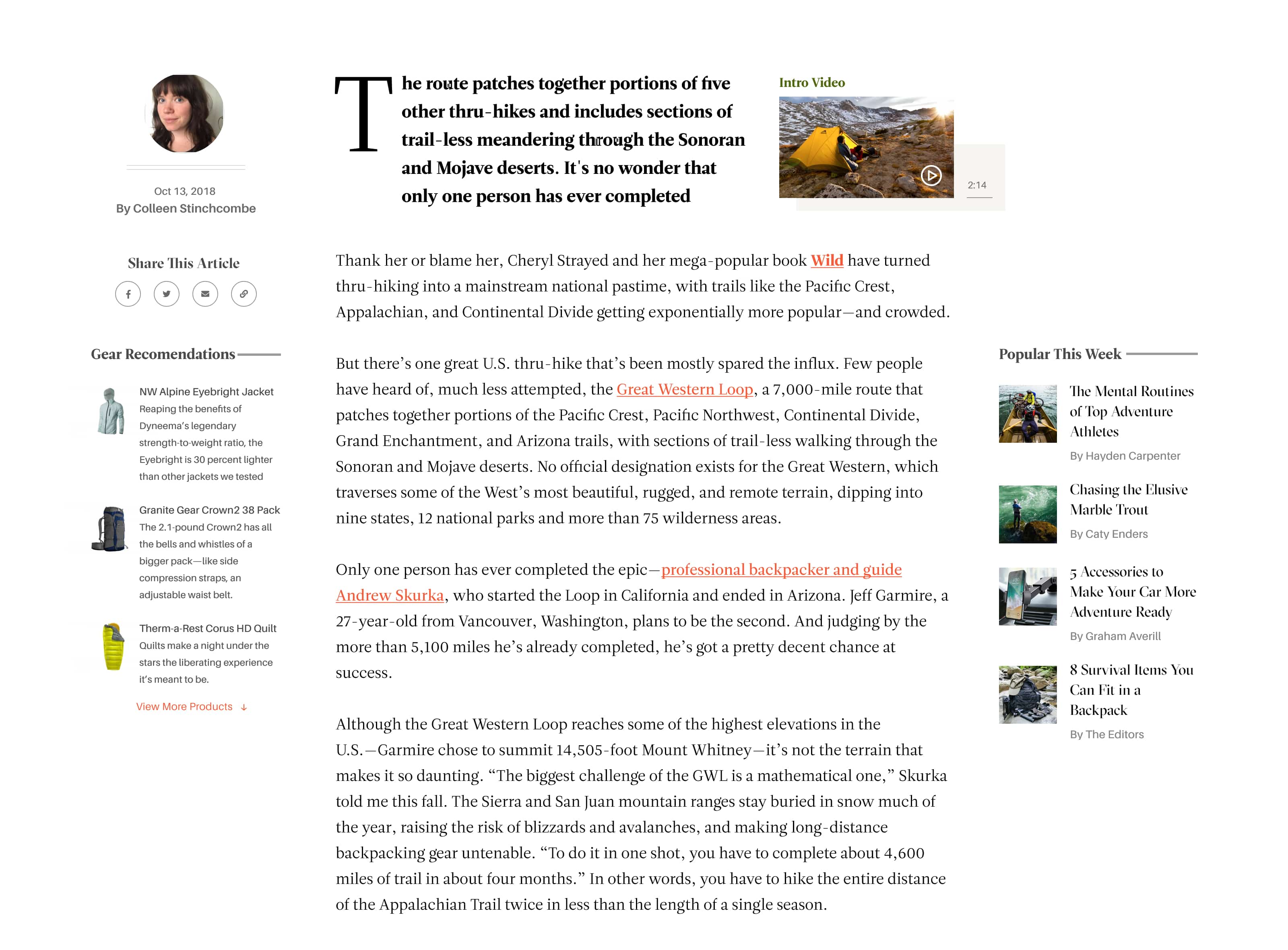
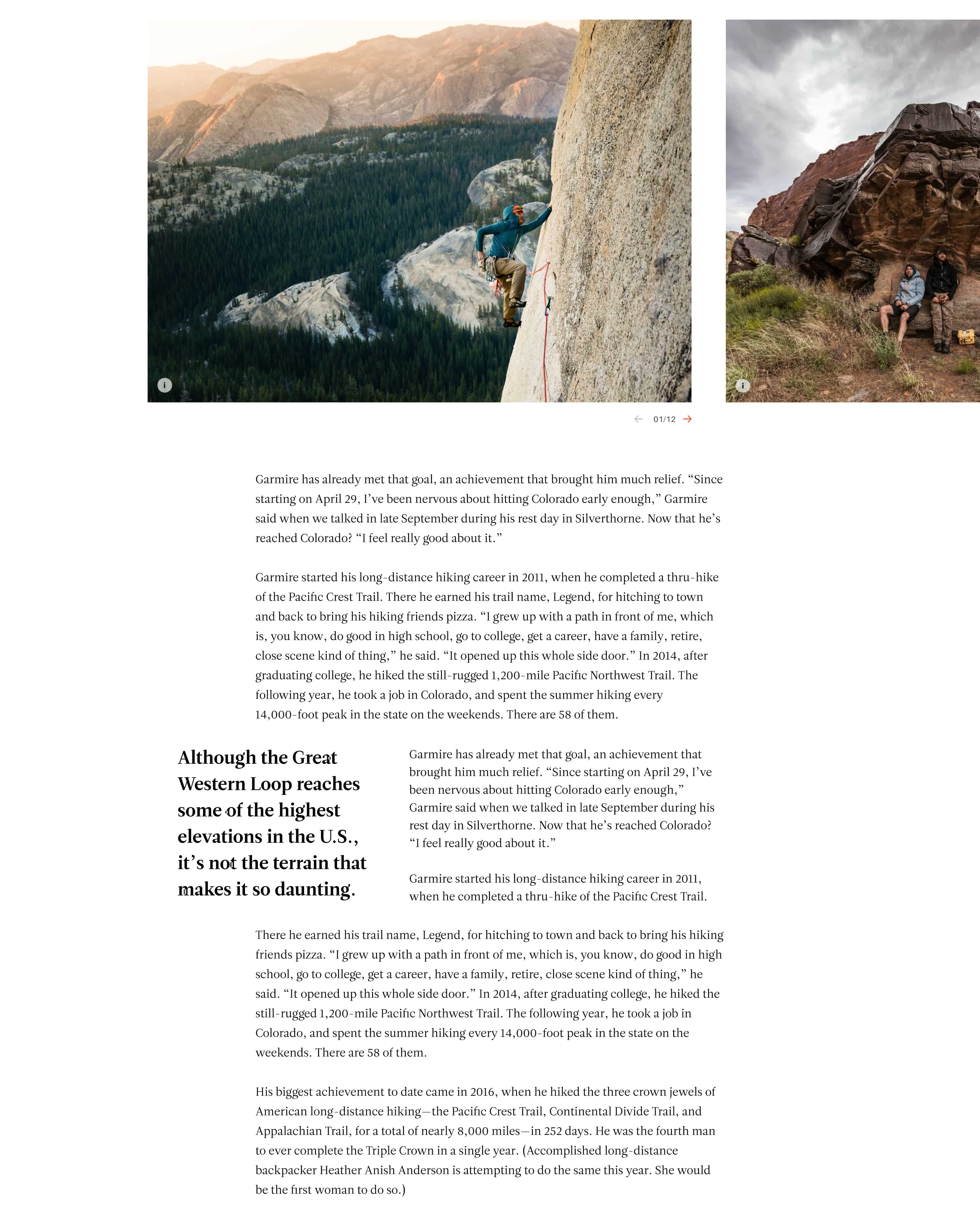
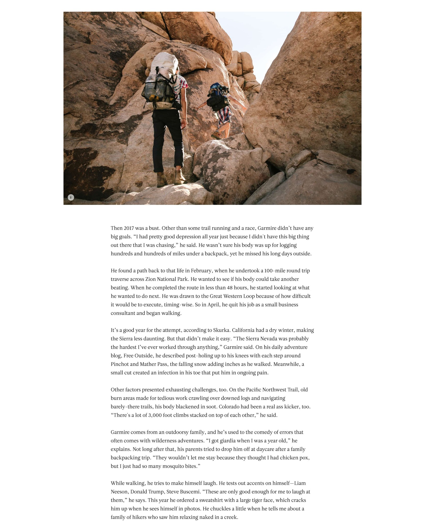
In addition to the homepage, the articles themselves needed to be equally engaging. The content had to be well-written and visually appealing, with a clear and concise message that would hold the reader's attention. A thorough and well-thought-out typography system was also crucial in elevating the overall aesthetic of the design and making it stand out from other magazines.
Homepage

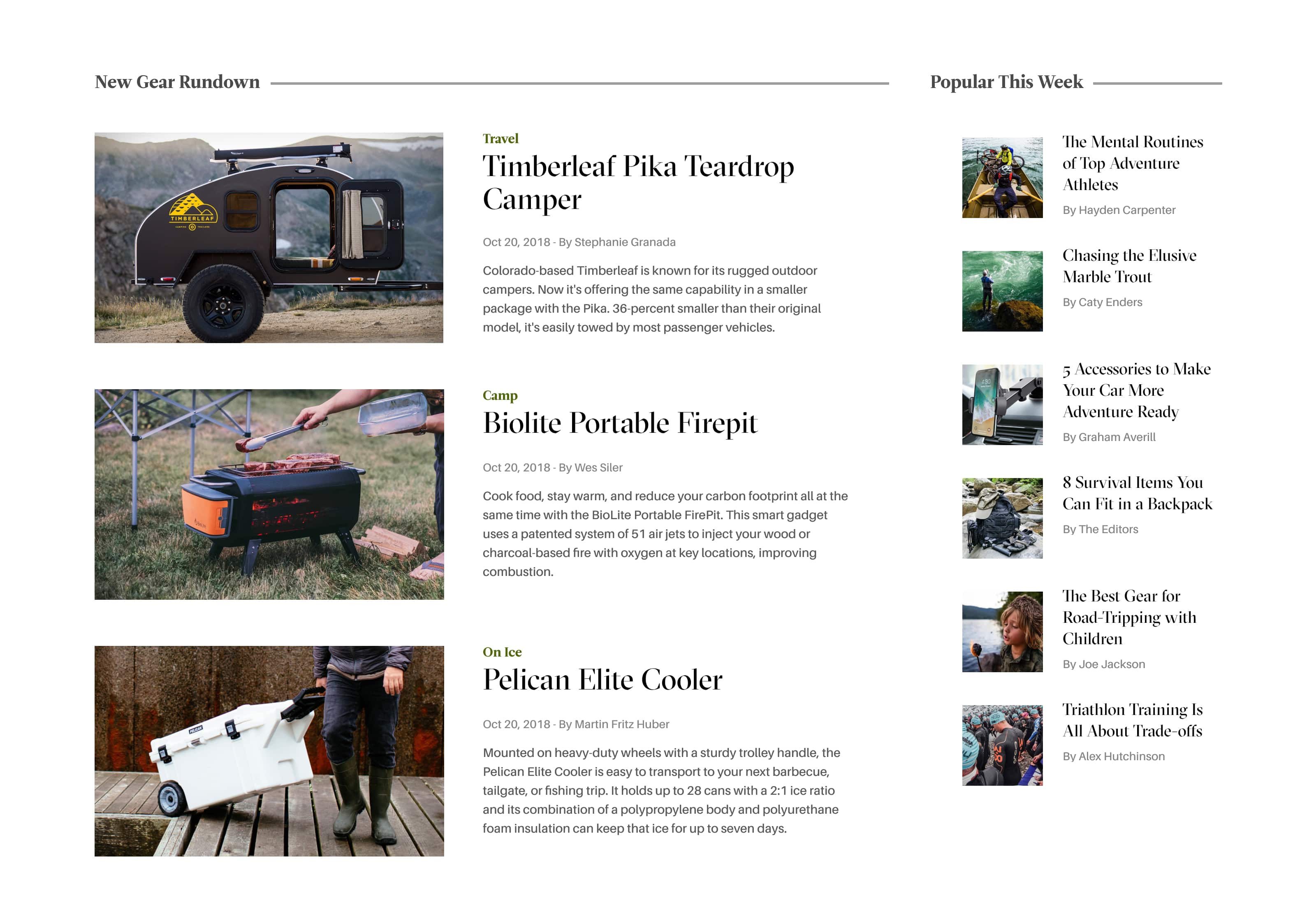
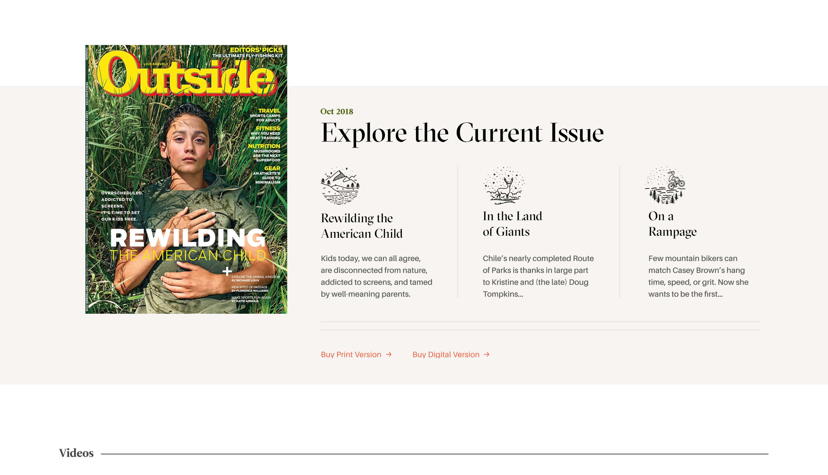
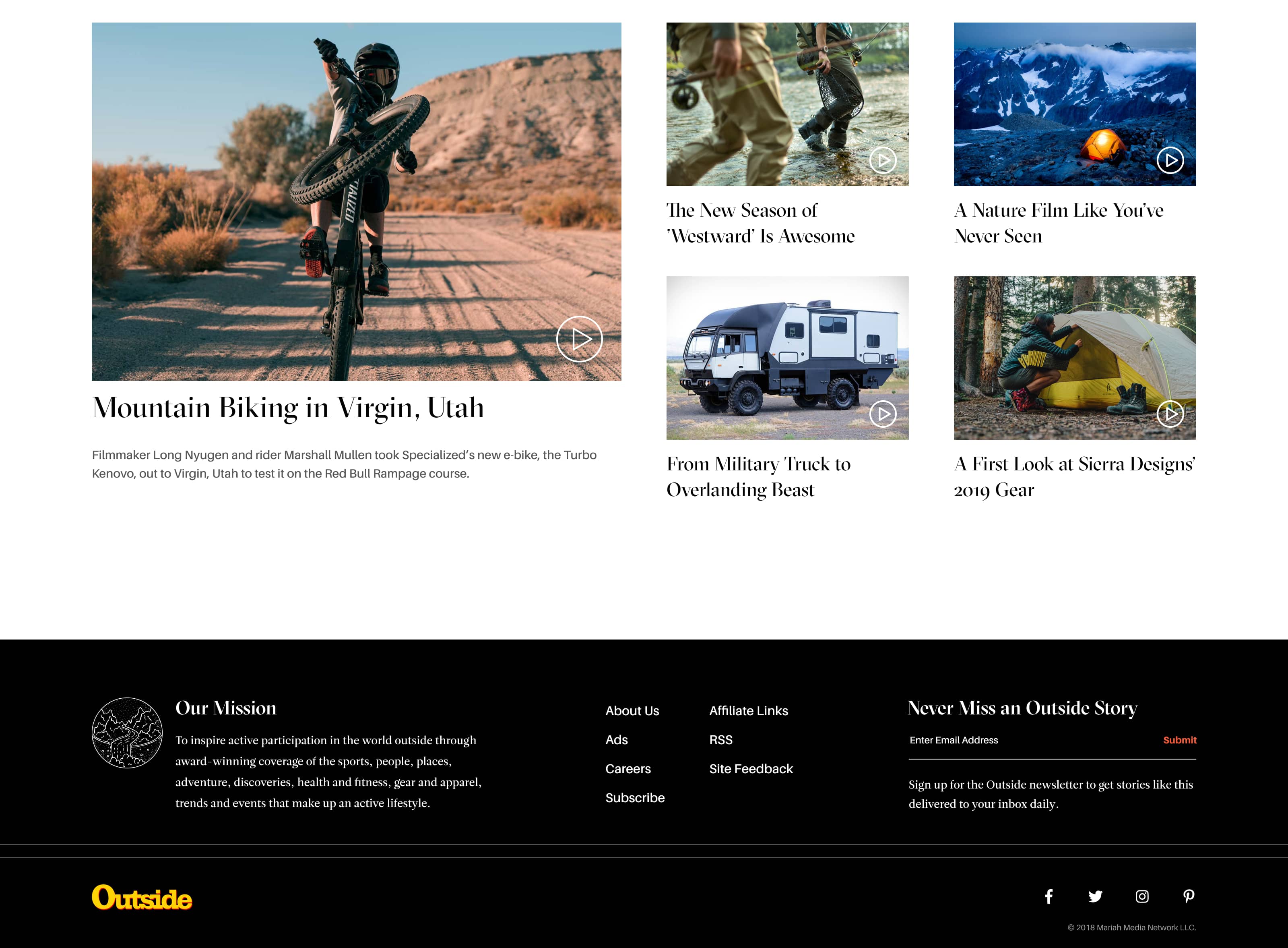
Scaleable Type System

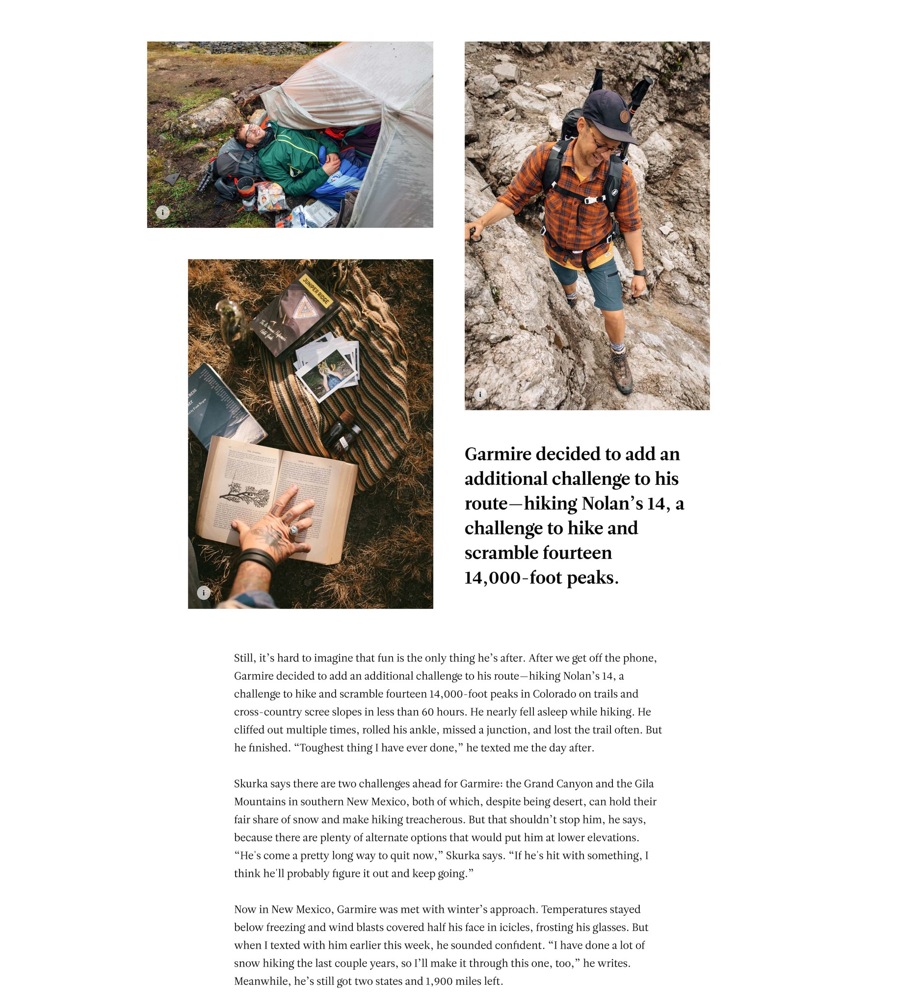
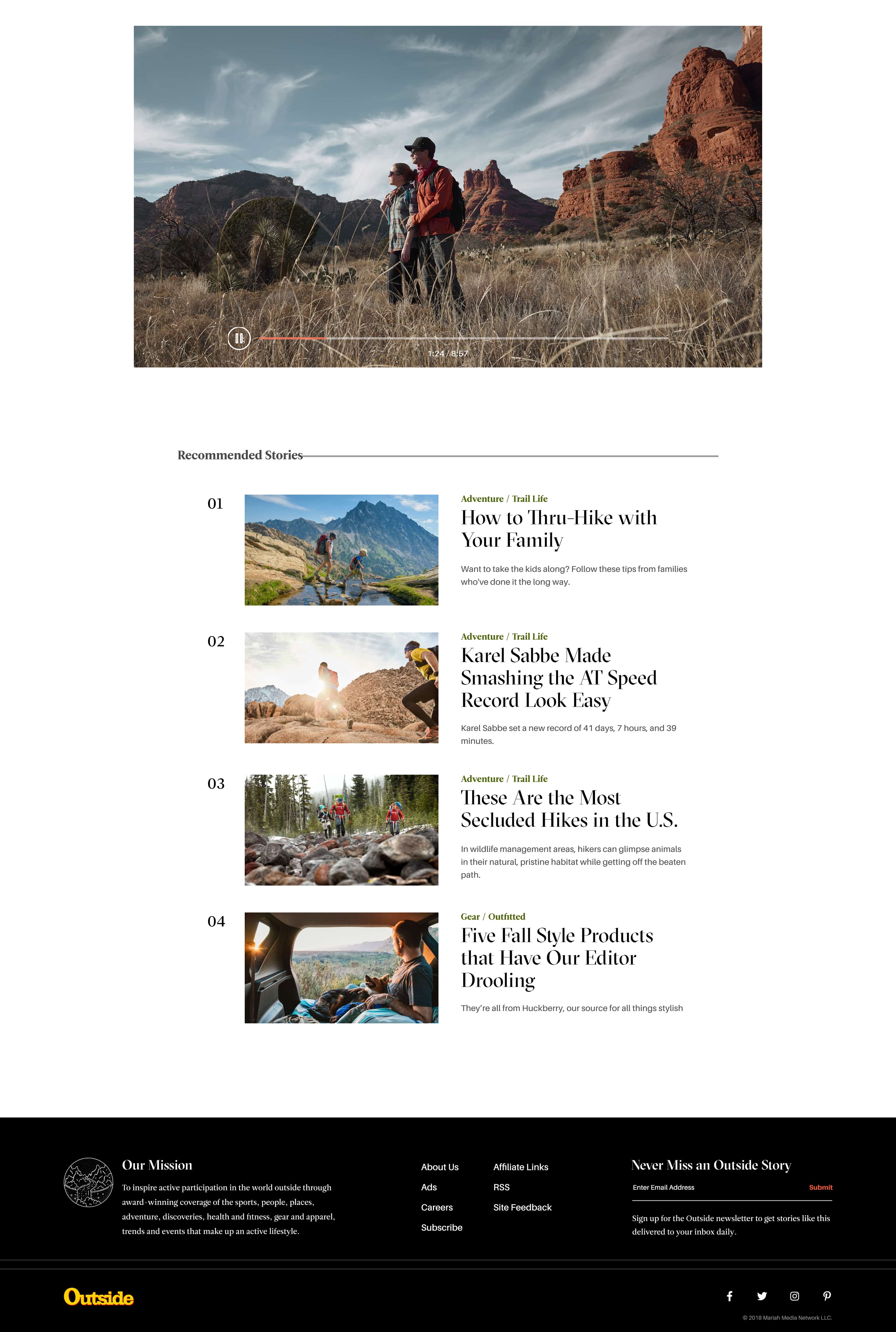
Article Page
Want to work together?

© 2024 Jason Kirtley - Don't copy my work, or I'll eat your soul!
Want to work together?


© 2023 Jason Kirtley - Don't copy my work, or I'll eat your soul!
Want to work together?


© 2023 Jason Kirtley - Don't copy my work, or I'll eat your soul!
Have a great project you think I’d be a perfect fit for?

